In the making: Shadcn theme

Series: Themes
- In the making: Shadcn theme
Introduction
When I was working on my personal portfolio, I had an idea to port the UI I was using over to XenForo. Since the UI Library was for React components and XenForo doesn't support React, it was initially challenging to adapt it.
After persistent effort and research, we figured out a way to make it work with XenForo.
The Shadcn UI Library has a very calm and subtle design, featuring dark colors and nice accent colors. It's known for its simplicity and minimalism. There's no XenForo theme out there with the same features as Shadcn.
Index

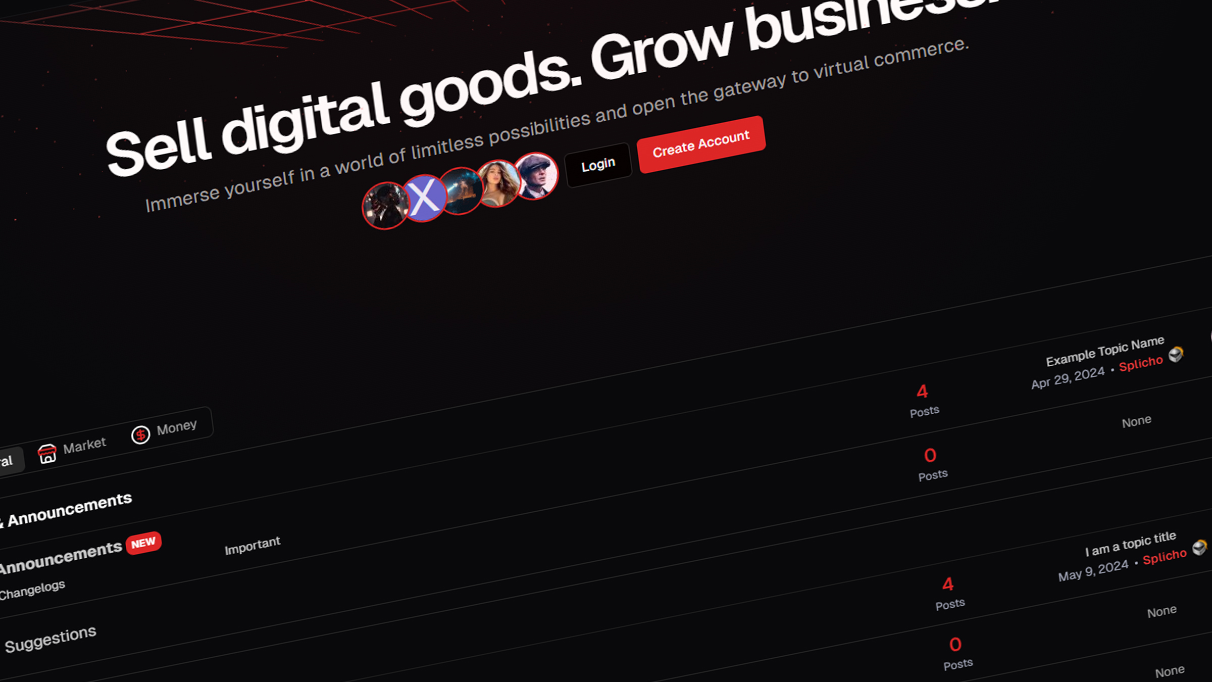
The index was completely redesigned from scratch. We added a welcoming hero section that displays a heading, a forum description, and the five most recent (customizable) registered members. This hero section features a unique background animation with flying particles, making it more attractive and engaging for visitors.
Additionally, the node list has been streamlined to show only the essentials: node names, subnodes, and node extras like avatars, thread names, and post counters. We removed everything else to maintain a clean and simple design.
If you feel the need to reintroduce elements like the Node Description, there's no need to worry! You can easily add them back through the Style Properties of our theme. This gives you the flexibility to customize the appearance and content of your forum according to your preferences without any hassle.
Authentication
The Login and Register page underwent a complete redesign, featuring a split-screen layout. On the left side, you'll find the traditional login form, while the right side showcases customizable images sliding through.
This design approach was chosen to align with modern trends, providing users with an engaging and visually appealing experience. The split-screen layout offers a balance between functionality and aesthetics, catering to the expectations of contemporary web users.
Postbit

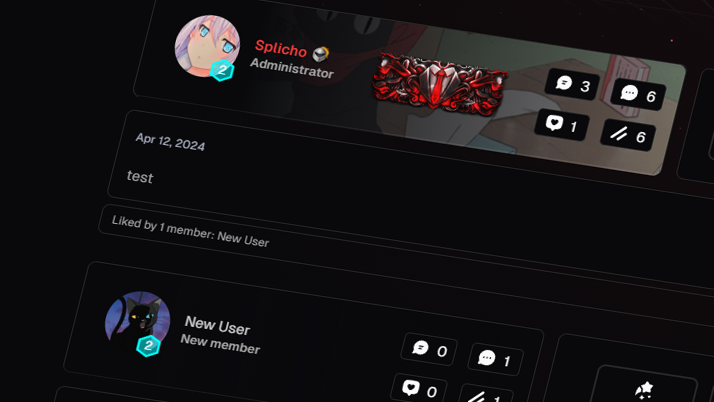
The postbit has been given a fresh, distinctive appearance to set it apart from other designs. Instead of the conventional vertical layout, we opted for a horizontal layout to create a unique look. The redesigned postbit includes the following displays:
- Post, Like, Thread and Credit counters
- Single userbar of primary usergroup
- Vouch and Reputation displays
- Years of Service hexagon style, will change shape and colors based on account age.
- Award collection
Direct Messaging

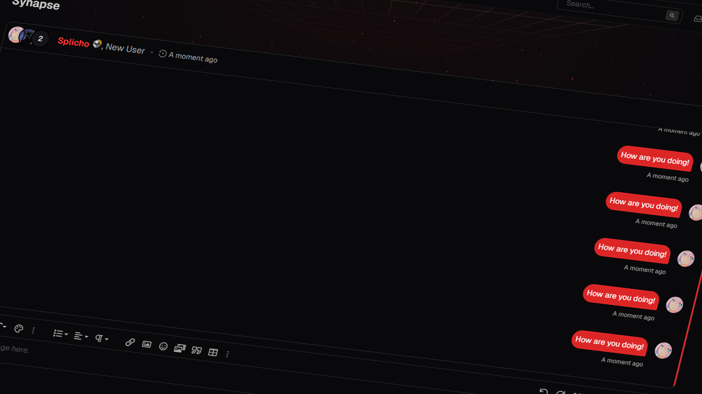
Direct messaging other users has been transformed into a visually stunning and user-friendly experience. The messaging system now resembles a real messaging app, complete with speech bubbles aligned to the left and right for easy conversation flow.
To enhance usability, we introduced the Chat Participants feature at the top left corner, allowing you to quickly see who is participating in the conversation at any given time. Additionally, message read and delivered check marks have been incorporated, providing real-time feedback on the status of your messages, ensuring seamless communication.
Search Messages
With one of our included addons, searching for messages in real-time has never been easier. This feature ensures a seamless search experience, allowing users to find the information they need quickly and efficiently. Whether you're looking for specific messages or trying to locate a particular conversation, our addon makes it simple to search through your messages with ease.
Info:
We'll gradually expand the documentation with more information and features as development progresses.
